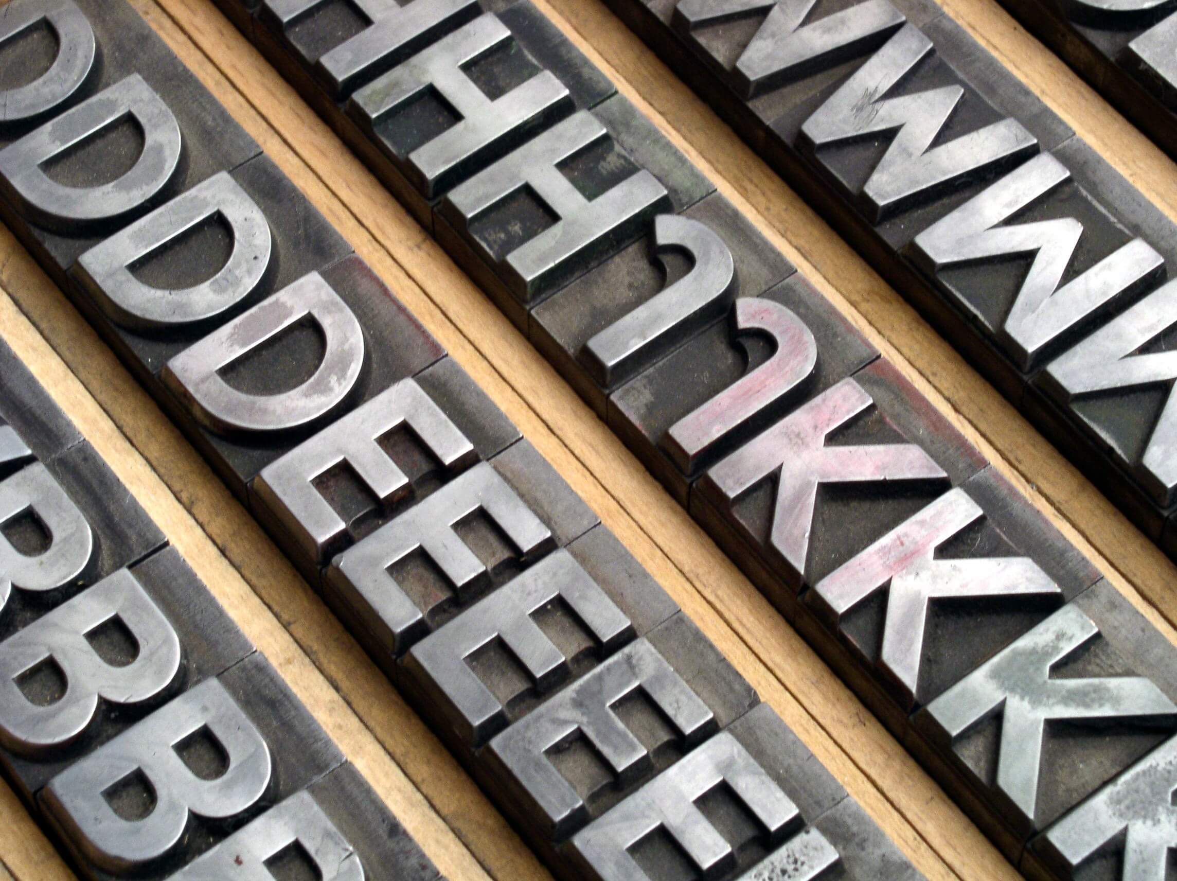
Photo: Lead type
As people said, web design is 95% typography. Once upon a time, people who care about the typography of their website define their font stack using CSS like this:
font-family: "Lucida Sans Unicode", "Lucida Grande", sans-serif;They secretly wish their website could look different from the mortal websites which use Times New Roman, Arial, or Georgia with the funny-looking numerals.
Until one day, their sincerity impressed the god of typography, who granted them a technology named web fonts. They can finally use their favorite fonts on the web:
@font-face {
  font-family: 'Popular Sans';
  font-style: normal;
  font-weight: 400;
  src: url(https://server-address/popular-sans.woff2) format('woff2');
}

font-family: "Popular Sans", sans-serif;
With the blessing of some free web font services, people do not worry if their website will look different across devices anymore.
Time flies, they eventually realized that many of the available free web fonts are only designed with “acceptable” quality, while the high-quality fonts like Lato, are overused way too much. In the same time, some commercial web font services who have high-qualify fonts, are often utterly expensive with a ridiculous subscription model.
Some other people decided to serve their own web fonts with CDN. They encountered issues with names they never heard before, such as CORS and FOUT. Readers from some regions of the world complained that the content was loading slowly, even worse, the rendering was sometimes entirely blocked since the CDN server was not reachable.
It’s now 2018. The latest devices usually come with beautiful system fonts. People rethought the core value of a good web font stack: the fonts should 1. look beautiful, and 2. feel performant. As a trade-off, the website does not need always to look the same across all devices, not necessarily. The new system font stack thus returns. It looks like this:
font-family: -apple-system, BlinkMacSystemFont, "Segoe UI", Roboto, "Helvetica Neue", Arial, sans-serif;It loads fast — there is no more external asset loading required. It looks beautiful and renders well on every mainstream operating system. The recently released Bootstrap 4 selected such a native font stack. I have also just updated my blog theme hugo-tanka with this font stack, hoping it could bring better reading experience.
Will the web typography technology evolve again in the next few years? Maybe. Will people change their font stack to the trending one again? Yes, we will probably often do that. Because we enjoy change, we really do.
